
Thread Starter
#1
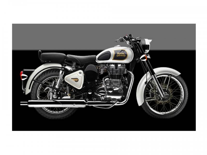
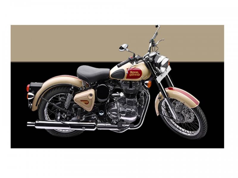
I'm out of words. So let the pictures do the talking. And oh, there are new colours for the motorcycles too.
Sob sob, overwhelmed![[cry]](https://www.theautomotiveindia.com/forums/images/smilies/Cry.gif "Cry [cry]") .
.
Sob sob, overwhelmed
.Attachments
-
 27.4 KB Views: 2,475
 -
 20.7 KB Views: 343
 -
 30 KB Views: 1,404
 -
 43 KB Views: 4,545
 -
 54.4 KB Views: 454
 -
 53.2 KB Views: 609
 -
 55.8 KB Views: 369
 -
 52.5 KB Views: 526
 -
 54.3 KB Views: 776
![[clap]](https://www.theautomotiveindia.com/forums/images/smilies/Clap.gif "Clap [clap]")
![[;)]](https://www.theautomotiveindia.com/forums/images/smilies/Wink.gif "Wink [;)]") .
.